السلام عليكم ورحمة الله وبركاته
اعزائى الكرام اعضاء ساسو سوفت
درسنا اليوم منتهى الروعة والجمال
عذرا الشرح انجليزى منقول
قد تحتاج لتحميل الخطوط العريضة المستخدمة في بعض أنماط الطبقة التالية. للقيام بذلك، انتقل إلى تحرير -> مدير الإعداد المسبق، واختر من القائمة المنسدلة ملامح نوع الإعداد المسبق أسفل القائمة
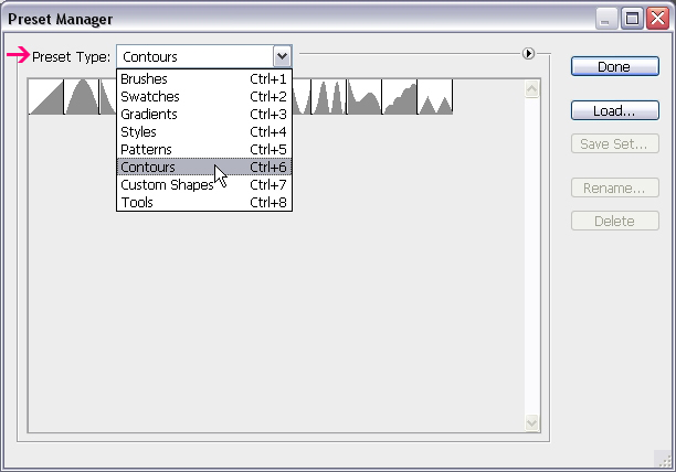
انقر فوق السهم الصغير في الزاوية اليمنى العليا، واختيار ملامح.
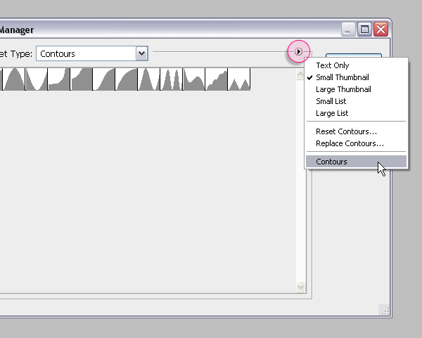
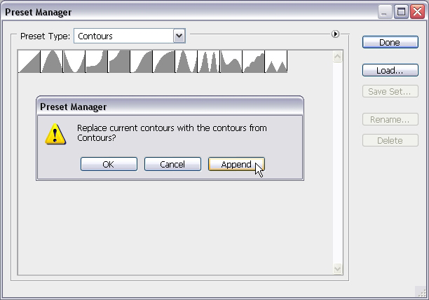
انقر فوق إلحاق لإضافة ملامح جديدة إلى القائمة.
الخطوة 1
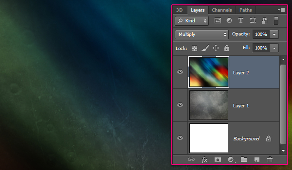
إنشاء جديد 1024 × الوثيقة PX 768. وضع مادة 235 صورة في أعلى طبقة الخلفية، تغيير حجم ثم بحيث تناسبها داخل المستند.
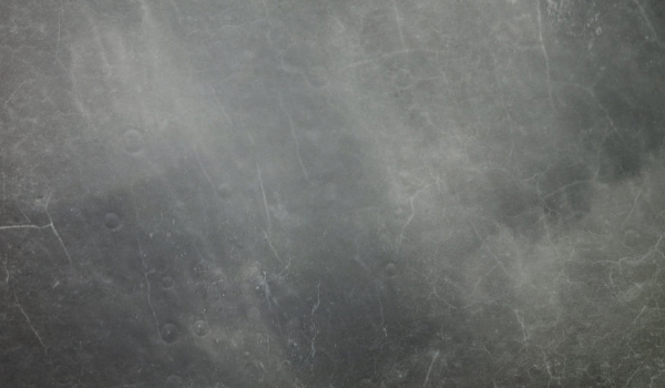
وضع الملمس صورة الشفق القطبي الشمالي على رأس جميع الطبقات ثم تغيير وضع طبقة مزيج الخاصة به لتكاثرها.
الخطوة 2
خلق النص باستخدام أداة الكتابة الأفقية (T). لون النص هو 7b7b7b #، الخط المستخدم هو رمز، وحجم هو 300 نقطة. في لوحة الحرف (نافذة -> حرف)، قم بتعيين قيمة تتبع إلى 75 PX
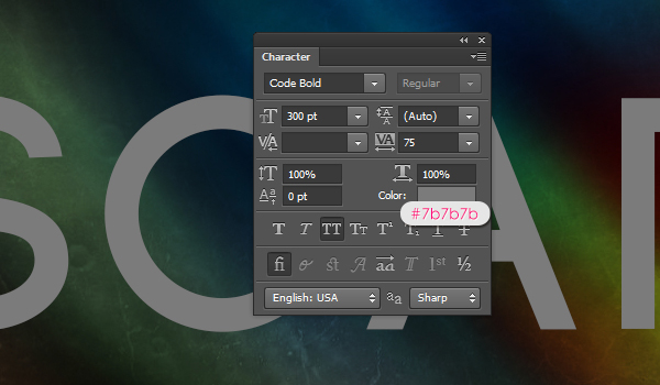
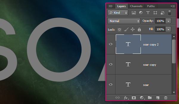
تكرار طبقة النص مرتين بحيث يكون لديك طبقات النص الثالث: الأصلي، نسخة، ونسخة 2.
الخطوة 3
انقر نقرا مزدوجا فوق النص طبقة النسخة الأولى (واحد في الوسط) لتطبيق نمط الطبقة التالية:
الشطب والنقش: تغيير النمط إلى السكتة الدماغية مزخرف، والتقنية إلى أزميل الصلب، وعمق إلى 350، حجم إلى 20، حدد المربع مكافحة مستعارة، تغيير وضع تسليط الضوء على لحية خفيفة، لونه إلى # 9ea761، وتغيير لون الظل # 7b7b7b الوضع.
والسكتة الدماغية النقش يتطلب تأثير في المخ لتكون نشطة من أجل إحداث تغيير. لذلك حتى نبدأ بتعديل تأثير السكتة الدماغية، والمضي قدما وتغيير ما تبقى من الشطب والنقش الإعدادات.
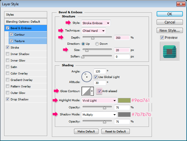
اختر خطوات، وعلامة في المربع
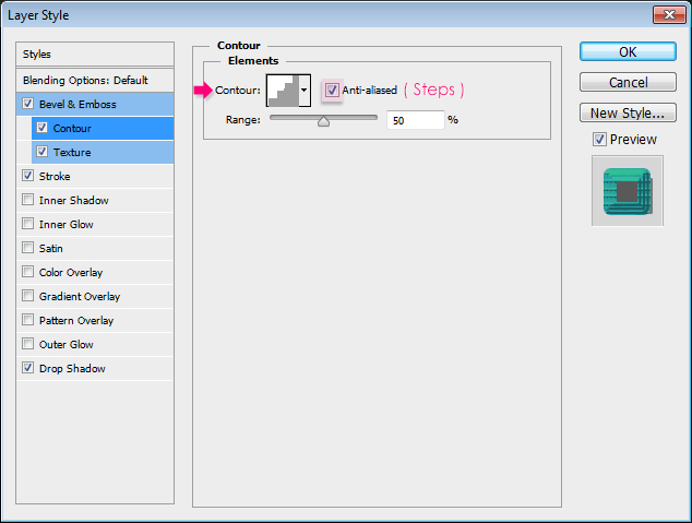
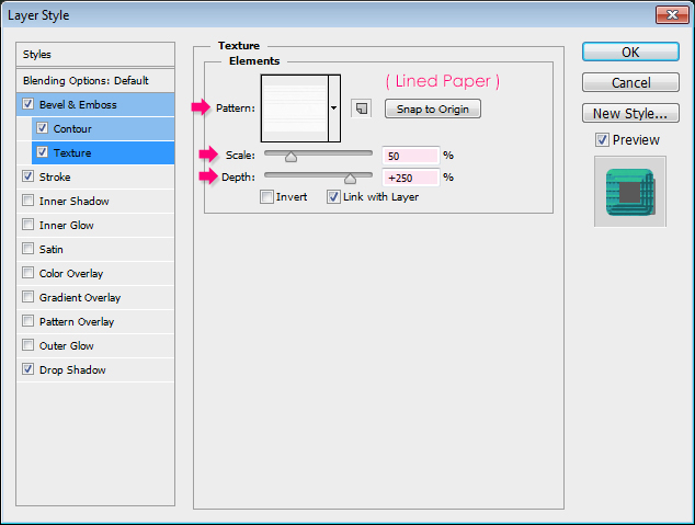
اختيار نمط ورقة مسطر، تغيير مقياس العمق وإلى 50 إلى 250
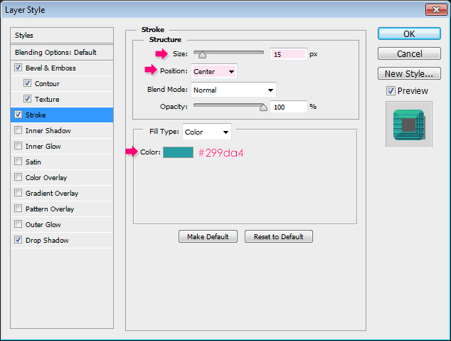
تغيير الحجم إلى 15، والموقف من مركز، واللون إلى # 299da4.
<a href='http://ads.kelbymediagroup.com/www/delivery/ck.php?n=a664410f&cb=INSERT_RANDOM_NUMBER_HERE ' rel="nofollow" target='_blank'><img src='http://ads.kelbymediagroup.com/www/delivery/avw.php?zoneid=124&cb=INSERT_RANDOM_NUMBER_HER E&n=a664410f' border='0' alt='' /></a>
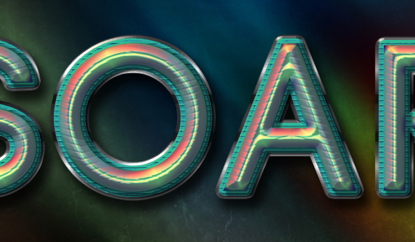
 Colorful Futuristic Text Effect
January 3, 2013 by Rose Effects, Text, Tutorials Leave a comment
This tutorial explains how to create a colorful futuristic looking text effect, using a couple of Layer Styles for multiple layers, and a simple brush.
Tutorial Assets
Colorful Futuristic Text Effect
January 3, 2013 by Rose Effects, Text, Tutorials Leave a comment
This tutorial explains how to create a colorful futuristic looking text effect, using a couple of Layer Styles for multiple layers, and a simple brush.
Tutorial Assets
1- Code font.
2- Texture 235 by Sirius-sdz.
3- Northern Lights by estelmiire.
4- Lined Paper pattern.
5- Subtle Zebra 3D pattern.
6- gradient-shapes for Photoshop by ilnanny
7- Sparklies Photoshop Brushes pack by redheadstock.
Loading the Contours
You might need to load the Contours used in some of the Layer Styles below. To do so, go to Edit -> Preset Manager, and choose Contours from the Preset Type drop down menu.
Click the small arrow in the top right corner, and choose Contours.
Click Append to add the new contours to the existing ones.
Step 1
Create a new 1024 x 768 px document. Place the Texture 235 image on top of the Background layer, then resize it so that it fits within the document.
Place the Northern Lights texture image on top of all layers then change its layer’s Blend Mode to Multiply.
Step 2
Create the text using the Horizontal Type Tool (T). The text color is #7b7b7b, the font used is Code, and the size is 300 pt. In the Character panel (Window -> Character), set the Tracking value to 75 px to avoid overlapping of the stroke.
Duplicate the text layer twice so that you have three text layers: The original, copy, and copy 2.
Step 3
Double click the first copy text layer (the one in the middle) to apply the following Layer Style:
Bevel and Emboss: Change the Style to Stroke Emboss, the Technique to Chisel Hard, the Depth to 350, the Size to 20, check the Anti-aliased box, change the Highlight Mode to Vivid Light, its color to # 9ea761, and change the Shadow Mode color #7b7b7b.
The Stroke Emboss requires the Stroke effect to be active in order to make a difference. So until we start modifying the Stroke effect, go ahead and change the rest of the Bevel and Emboss settings.
Contour: Choose Steps, and check the Anti-aliased box.
Texture: Choose the Lined Paper pattern, change the Scale to 50 and the Depth to 250.
Stroke: Change the Size to 15, the Position to Center, and the color to #299da4.
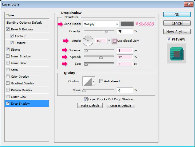
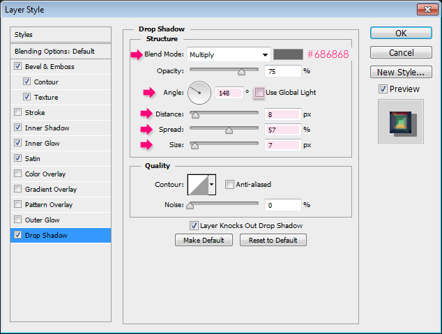
إسقاط الظل: تغيير اللون إلى # 686868، برنامج الأمم المتحدة للتحقق من الاختيار استخدام الضوء العالمية، تغيير زاوية إلى 148، والمسافة إلى 8، وانتشار إلى 57، وحجم إلى 7.
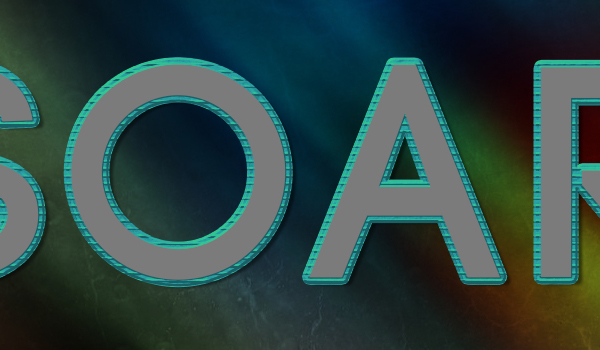
This will create the center stroke of the text.
الخطوة 4
انقر نقرا مزدوجا فوق النص النسخة الثانية طبقة (واحد في الجزء العلوي) لتطبيق نمط الطبقة التالية:
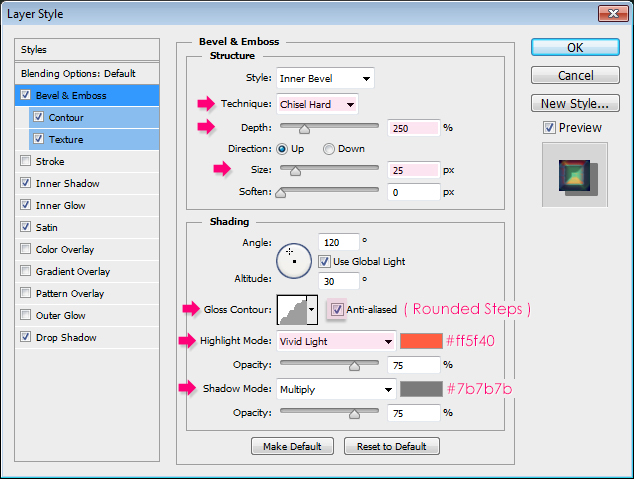
الشطب والنقش: تغيير هذه التقنية لأزميل الصلب، وعمق إلى 250، والحجم إلى 25، كونتور لمعان خطوات مدور، حدد المربع مكافحة مستعارة، تغيير وضع تسليط الضوء على لحية خفيفة، لونه إلى # ff5f40، و تغيير لون الظل # 7b7b7b الوضع.
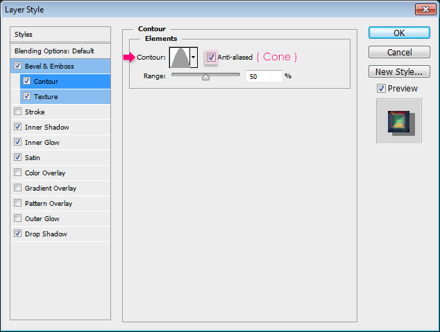
Contour: Choose Cone, and check the Anti-aliased box.
Texture: Choose the Subtle Zebra 3D pattern.
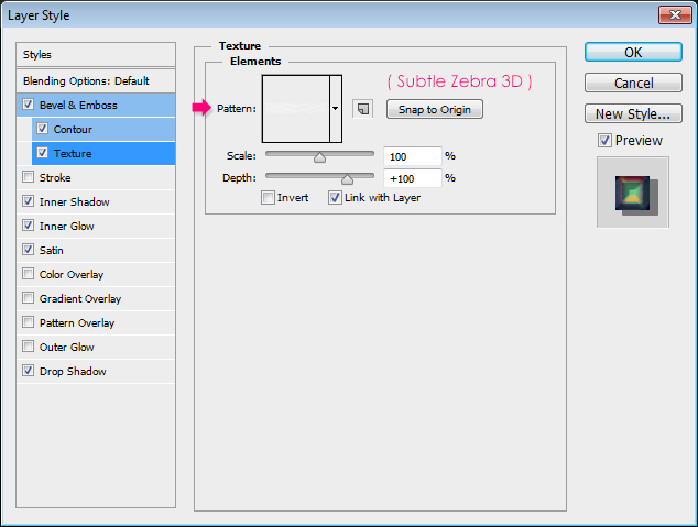
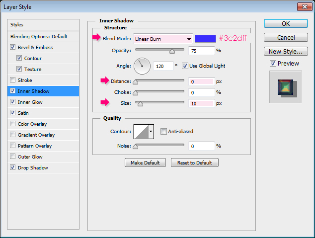
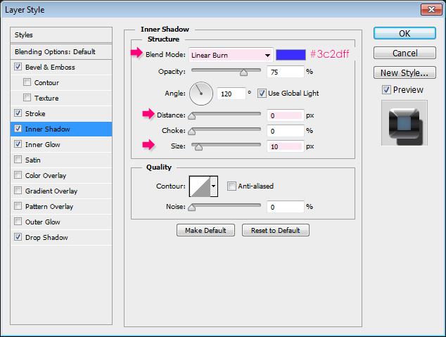
Inner Shadow: Change the Blend Mode to Linear Burn, the color to # 3c2dff, the Distance to 0 and the Size to 10.
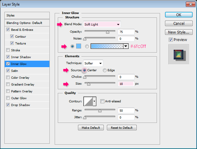
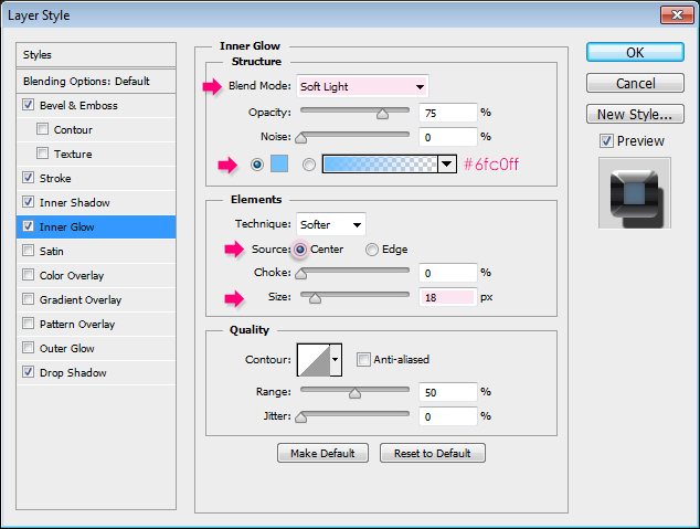
 Inner Glow: Change the Blend Mode to Soft Light, the color to #6fc0ff, the Source to Center, and the Size to 18.
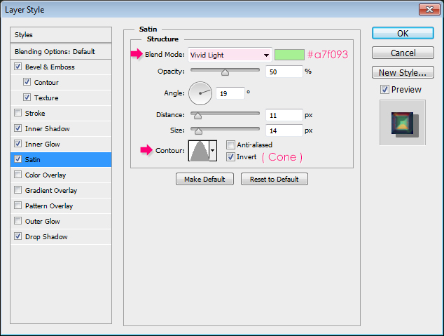
 Satin: Change the Blend Mode to Vivid Light, the color to #a7f093, and the Contour to Cone.
 Drop Shadow: Change the color to #686868, un-check the Use Global Light box, change the Angle to 148, the Distance to 8, the Spread to 57, and the Size to 7.
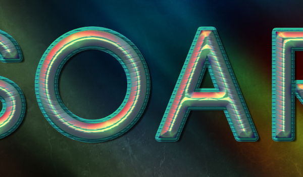
 This will create the main colorful part of the text.
 Step 5
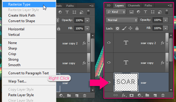
Right click the original text layer and choose Rasterize Type. This will make the text layer no longer editable, but will enable us to use the Brush Tool later on.
 Step 6
Double click the rasterized layer to apply the following Layer Style:
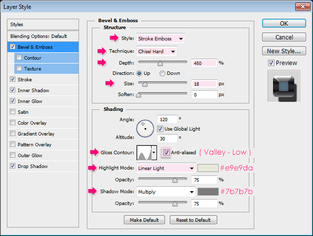
Bevel and Emboss: Change the Style to Stroke Emboss, the Technique to Chisel Hard, the Depth to 450, the Size to 18, the Gloss Contour to Valley – Low, check the Anti-aliased box, change the Highlight Mode to Linear Light, its color to # e9e9da, and change the Shadow Mode color #7b7b7b.
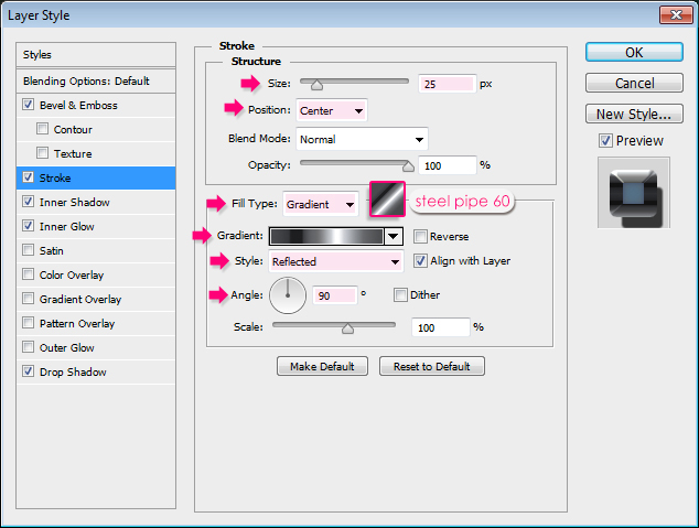
 Stroke: Change the Size to 25, the Position to Center, the Fill Type to Gradient, the Style to Reflected and the Angle to 90. Then, choose the “steel pipe 60″ gradient from the ” gradient-shapes for Photoshop” pack, in the “CHROMES.grd” file.
 Inner Shadow: Change the Blend Mode to Linear Burn, the color to # 3c2dff, the Distance to 0 and the Size to 10.
 Inner Glow: Change the Blend Mode to Soft Light, the color to #6fc0ff, the Source to Center, and the Size to 18.
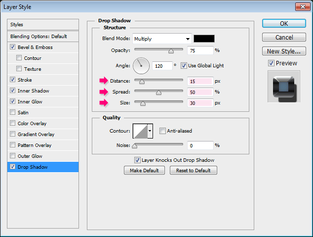
 Drop Shadow: Change the Distance to 15, the Spread to 50, and the Size to 30.
 This will create the metallic outer part of the stroke.
 Step 7
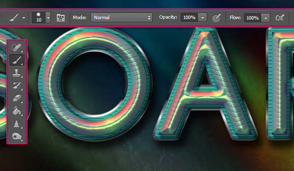
Pick the Brush Tool and choose a 10 px hard round brush.
 Next, we’ll start adding some dots to the tips of the letters. To do so, place the brush so that its tip touches the metallic stroke’s edge, then click to add the dot.
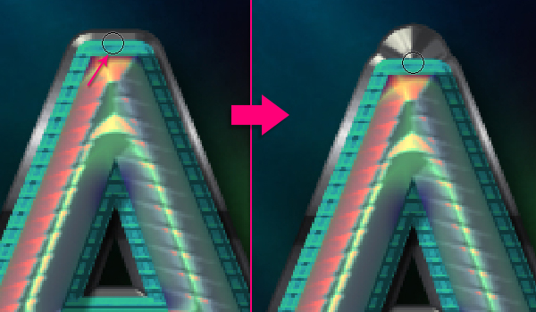 Do the same for the other letters. One to three dots for each letter is enough.
 Step 8
Create a new layer on top of all layers and call it “Holes”, then change its Fill value to 0.
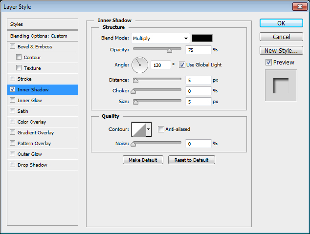
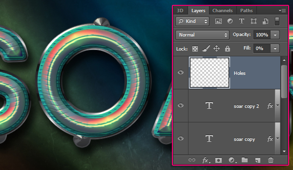 Double click the “Holes” layer to apply an Inner Shadow effect using the default values.
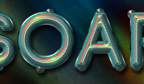
 With the same 10 px brush, add a dot in the center of each of the dots you created in the previous step. The Inner Shadow will make these dots look like small holes.
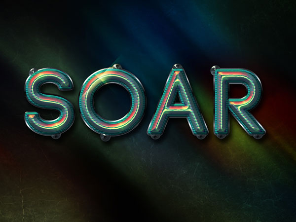
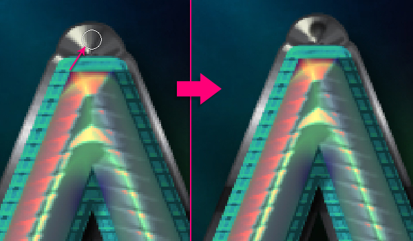 This is what you should get.
 Step 9
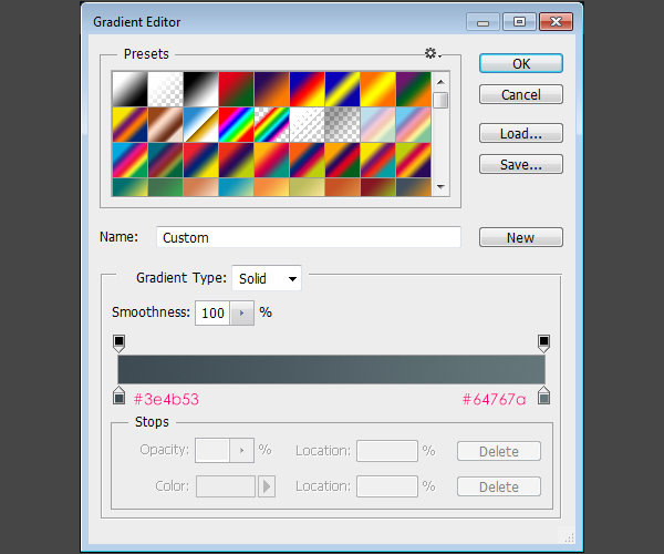
Click the ‘Create new fill or adjustment layer’ icon down the Layers panel and choose Gradient Map.
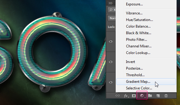 Make sure that the adjustment layer is on top of all layers and change its Blend Mode to Overlay and its Opacity to 80%. Then, click the Gradient box to create the gradient fill.
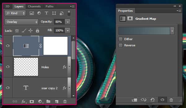 The gradient uses two colors: # 3e4b53 to the left and # 64767a to the right. The Gradient Map will intensify the colors and make them more vivid.
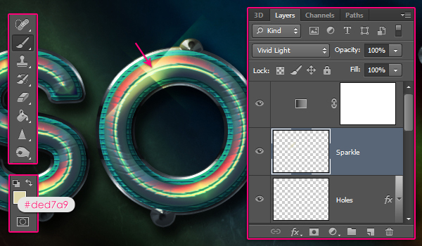
 Step 10
Finally, create a new layer right below the Gradient Map adjustment layer, call it “Sparkle”, and change its Blend Mode to Vivid Light. Set the Foreground color to # ded7a9 and pick the Brush Tool.
Use one of the Sparklies Photoshop Brushes, (decrease its size as needed), to add a big sparkle on top of one of the letters to finish the text effect up.
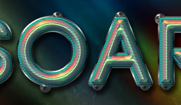
 Conclusion
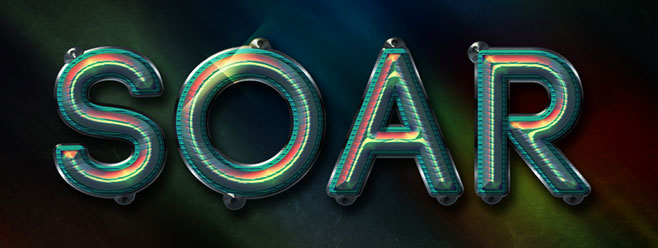
This is the final result. Many Layer Styles were used to achieve both the main effect and the stroke, as well as many bright colors everywhere. Hope you enjoyed the tutorial and found it useful. Please feel free to leave your comments and suggestions below.
الصور لاتحتاج الى شرح بالعربية
تحياتى


 منذ /01-02-2013, 09:43 PM


 المواضيع المتشابهه


 العرض العادي

